What are Serif fonts? 3 ways they can better your medical illustrations

Serif is the small stroke found at the end of each character or symbol within a font family. In Serif Fonts, all characters have serifs at the end of larger strokes.

A little history of serif fonts
To help our understanding of Serifs, we’ll dive into the history first. If you haven’t already, check out our Typography article first.
Serifs take inspiration from Greek carvings in stone and Latin alphabet found in Old Roman cities. Some say that the serifs were born because stone carvers followed brush marks that flared at the end and corners, creating serifs. Others disagree and say that serifs were created because letters just looked neater this way.
However, more recent explanations point toward the fact that serifs just help the eye of the reader be grounded in the base of the line, and since we read groups of words at a time, this can be helpful for longer readings.
Serif Styles
Serif fonts have been around for quite a bit, and in that time they’ve gotten classified into different subgroups.
Old Style Serifs
They date as far as 1400s when Gutenberg’s printing press came around. Italian printers decided to make their own typefaces, breaking away from Gutenberg’s blackletter style, and even later creating italics that saved space on the expensive pages and was inspired in calligraphy styles from the Renaissance period.
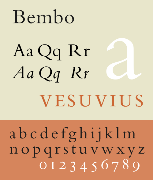
If you want your medical illustration to have an old science veneer, pick one of the old-style serif fonts like Bembo.

Transitional or Baroque
These fonts came around mid 1800s until 1900s. They are considered to be an in-between old style fonts and modern fonts, thus transitional.
Some well-known examples you see everyday are Times New Roman and Baskerville. They usually come pre-installed in most computers.
Times New Roman is a great choice for a journal medical illustration, since most of us are used to seeing it everywhere, so it’s quite familiar.

Some beautiful free examples can be found in this article.
Didone or modern
Later around the end of the 18th century, the typefaces we’ve come to know as “modern” were invented. They feature great contrast between thick and thin strokes with thin serifs. They are considered less readable than their former counterparts, old-style and transitional.
A nice example of these fonts is Bodoni.

Slab serif
These fonts were designed for posters and big designs in the 19th century. They were meant to seize the reader’s attention. They have thick slabs serifs and geometric design. A famous example is Rockwell, a serif font that features very geometric slab.

These fonts can be a great compromise between sans-serif and serif, with added readability for our medical illustration designs. I prefer to use it for legends and nametags occasionally.
Better medical illustrations with serif fonts you say?
Yes! Serif fonts are associated with old texts, formality and academia.
The old Gray’s Anatomy book featured medical illustrations with italic serif fonts.

Anatomy of the Human Body. 1918.
Now, you as a medical illustrator armed with this new knowledge, you can:
1. Add formality to medical illustrations
The associations of serif fonts with academia and science date back centuries, and they are pretty much ingrained in the reader’s mind. Instead of fighting this, ride on this and add a pinch of formality to your illustrations by choosing a serif font to go with your illustration. If you want to spice it up, you can set the titles in serif and the name tags in sans-serif to add contrast.
2. Improve readability and reading speed for paragraphs
If you’re adding a paragraph or chunk of text in your medical illustration or medical infographic, it might be a good idea to deploy a serif font for the task. They have been historically linked with increasing the readability and speed of passages of text and with small text, as the serifs guide the reader’s eye back to baseline and make it easier to find their footing when changing lines. You can pair this up with good text layout and composition to do the trick.
3. Choose the best font for Print media like magazines
Serif fonts are considered to be easier to read in print media, as opposed to sans-serifs that are considered to be better for computer and screens, since the serif can barely be distinguished at smaller font sizes (too pixelated) to do their job well and scale badly on lower resolutions.
Check out our top 5 pick of free serifs to use in your medical illustrations.

Leave a Reply