Text Layout and Composition for Medical Illustrators

Besides the usual nametags and labels for parts, medical illustration requires text layout containing definitions and explanations to help the reader, and proper placement and composition can definitively make the difference in terms of aiding or hurting our overall design and composition, in terms of legibility and readability just to name a few.
If you haven’t already, check out our tutorial on Typography to get a good idea of the terms we’re using here.
Text Layout
Dividing large bodies of text into paragraphs is important. Dividing text will help present content in consumable chunks that won’t intimidate the readers of your medical illustration. Content should be so well presented that it remains king. With good typography, you can draw interest to your medical illustration and make it comfortable to read chunks of text present in it, so much so that the text vanishes in the background and simply lets the content shine on its own.
Legibility
Measures the ability to decipher something. It measures how easy or difficult it is to see the differences between one letter of a typeface and another.
Well legible characters of a typeface have:
- Individual character shapes clearly defined
- Large x-height and counter spaces
Serifs are said to be more legible for lengthy reading
Factors that can affect the legibility of texts within your medical illustration
- Details that differentiate each characters (i.e Sentence case is easier to read than all caps)
- Helping the eye to jump from one line to the other
- Too bold or too light is difficult to read
- Space between lines should be just enough they don’t touch and a bit more
- Line length: 52-72 characters
- Sizes for text type: 8-12pt
- Text on screens needs a little more tracking. (But auto setting is usually just fine)
- The texture and background you choose for your medical illustration will affect the legibility of your text, choose wisely when placing text and legends on top of the illustration itself.
- Black background is not ideal for extended reading or viewing on a medical illustration
Readability
Readability has everything to do with how much the reader wants to read your text, how appealing it is. A piece of text might be perfectly legible but not appealing to the reader.
Small changes create entry points for the reader to re-enter your medical illustration, for example, on an infographic.
- A line or break or two
- Appropriate places to place drop caps create focal points
- Pulling out Interesting sentences from the text and putting them as quotes in bigger font
- Changing the color of the text.
- Dividing the text into smaller chunks.
- Using smaller columns so that the eye doesn’t have to go too far.
- Adding a colorful detail at the end or beginning of chunks of texts.
Readability is all about how appealing is the text to the reader.
Alignment
You deal with this all the time even if you don’t notice. The most important thing is to be consistent about it, if you choose to align to the left most elements in your medical illustration should follow suit, unless you deliberately want to draw attention by contrast.
Build your text along one primary axis and align elements to this grid line, as if it was a backbone. If using vertical, align to the left edge.
Justify left
Or ragged right or flush left. Easier to read for Western cultures as we read left-to-right. The most recommended for your medical illustration and infographics.
When in doubt, justify to the left and leave the rag to the right. Because of Western culture, people read from top to the bottom and left to right, so by justifying what people are mostly used to, the eye is able to find the edge and read much faster and easier.
Justify right
Or Ragged left or flush right. Not good for lengthy reading, the westerners will have a hard time finding its way back to the start of the line or go through your medical illustration text boxes.
Justified
No rag, everything is equally aligned to both sides. Quiet and balanced look. Most magazines, books and newspapers are set with justified columns. This could work for medical illustrations, if there are lengthy paragraphs and smaller columns.
They are created by varying the word spacing. The only problem is that it creates rivers and gaps around the paragraphs.
Sometimes it can be fixed with tracking.
Centered
It should be used for titles and short passages and titles in your medical illustration, never for lengthy reading. The eye has a hard time finding its way back to the start of the line.
Random or asymmetrical
They can be visually exciting for example, to use on medical illustrations featured in an infographic but it’s terrible for lengthy reading (say an anatomy or medical textbook). It’s fun and inviting for short pieces.
You can mix alignments, to make fun and exciting combinations.
Page space
A piece of typography has form and language. We have to consider the space around.
Proximity
Group related items together. We tend to read things that are closer together as related and things that are apart as unrelated.
Spacing matters, the closer things are together, the more the reader will assume a relationship exists between the two separate blocks of information.
People read 3-4 words at a time in one go.
Use rules/lines to group related blocks of information, making dissimilar objects appear more orderly.
Avoid the corners
Don’t place elements along the edge or corners unless to deliberately cut them off. Negative space is a good thing so let your design breathe.
The grid
Arranging content, containing text, dividing the page space. You can work within or selective break out of the structure.
Usually, designers base their grids on the Golden ratio, which is 1.618
Defining and using a grid helps create a composition that is refined and feels organized in some way. However, that shouldn’t deter you from breaking away from it, because allowing some small elements to break out of the grid will give the entire design a sense of dynamism as a whole.
Adhering to the grid creates Unity. Breaking out sometimes, creates Variety.
- Margins: inside should be generous
- Hang line: text and new chapters may begin
- Multiple columns
- Gutter: between columns, usually the size of the leading.
- Baseline grid: to make sure all text is in line with other columns
The most simple grid in typography is the one with single column text, margins, headers and footers.
Negative space/white space
It’s the empty area surrounding design elements. It’s the space between letters in a word, or the space between headline and the body text. It’s necessary to have these blank areas to focus on the important elements like the headline or product.
White space separates your content into sections without having to use lines.
- Improves readability
- Draws attention to images
- Emphasizes importance of a product in print design
- Consistent spacing for better overall composition
- Larger line spacing gives better user experience and readability (leading)
Hierarchy
You can make different types of content look different by applying hierarchy of text. You can guide the reader’s eye to what’s most important, where to begin and where to go next by placing emphasis on the most important parts, making them bigger and/or drawing attention, and then smaller sizes for the rest. You have to decide which elements the reader needs to see first and make them stand out.
Decide which elements you want the reader to notice first then make them bigger. You can use bold text, bigger sizes of fonts to draw the eye in some way.
Typographic space
- 66 characters is seen as the sweet spot before breaking the line,
- but up to 80 characters still work.
- And down to 40 characters for narrower columns of text.
Kerning
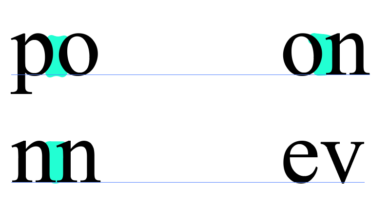
Space between two characters in a font. This can vary over the course of a word in a text layout and to make matters more complicated, some fonts have bad kernings, which makes the letters look badly spaced.
Our goal is to create a text layout that has a consistent rhythm of spacing between characters.
Kerning has usually been optimized for text type by the font creator, but certain fonts at Display sizes need manual adjustments.
Some pointers to adjust kerning:

- The narrowest space should be between two round sided letters
- The next widest space, between straight and round
- Two straight sided letters
- Open side and diagonal side letters
Leading
Spaces between lines of text or line spacing, baseline to baseline. The default setting is usually fine for most text layouts but you can make your text more comfortable to read when necessary by fine tuning it.
It’s called “leading” because of the pieces of lead you used to put between lines when printing.
Normal leading is 2pt+ than the font size.
The longer the lines, the more leading you want, to let the eye find its way back.
Typically books are set 9/12, meaning “9pt font and 12pt leading”
Tracking
Overall space between a group of letters. Helps fixing fonts that are poorly spaced.
This can affect the weight and legibility of a page.
You can use it to
- avoid widows and orphans.
- Fix gappy word spaces in justified paragraphs in columns.
- For big text, negative tracking, so that the word doesn’t disintegrate
- For smaller text, add some tracking
- ALLCAPS mixed with no caps, needs extra tracking.
Word spacing
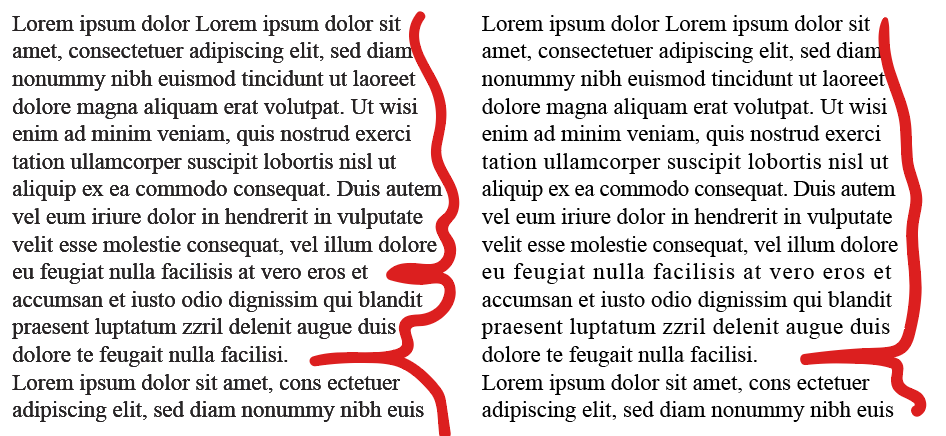
Since we read groups of words at a time, it’s a good rule of thumb to design a text layout that has a minimum of 6 words per line, this is done to avoid gappy word spacing and create a more cohesive text layout. In the same vein, try to avoid using force justified, because it creates rivers that run through the paragraph, causing a disjointed text layout.
When plotting out your text layout, avoid a widow word on the last line of paragraph. Likewise, don’t allow an orphan word to remain on a new column or page on it’s own.
Pay attention to the shape the rag creates, to avoid undesired shapes/angles that could create a text layout that is distracting or confusing. Good word spacing should be invisible, if you notice it, it’s because it’s wrong.

Hyphenation
They allow words to be broken midway, allowing the paragraph to be cut with smaller rags. When justified to an axis, the punctuation should extend beyond.
Paragraph spacing
The reader should have clear indication that they are starting and ending a paragraph.
We can achieve this using:
- Indents
They tell us that we’re about to start a new paragraph. It should be enough to be visible. One Pica is enough. - Line spacing
If space allows, leave half a line.

Leave a Reply