Typography for medical illustrators

Typography? Fonts? Typeface? What’s that have to do anything with Medical illustration? You wonder. But the fields of graphic design and medical illustration are more intertwined than you think. You don’t need to become a whiz in Typography, but with these pointers you can take your medical illustrations and infographics to the next level.
Typography
It’s the subject that deals with style and appearance of text. It’s the art of arranging “type” in a way that is readable and legible (yes, they are not the same thing). Think of it as a toolset you’ll pick up whenever you need to add legends and nametags to your medical illustrations.
Typography deals with the shape of the space between and around letters and words of a text as a whole, but also shaping the text itself.

Some definitions:
- Type: It’s a character, letter, number etc that arranged in a way with others. In traditional printing, it used to be that letters were carved into wood or lead blocks and then arranged to make paragraphs. In today’s digital world, the name remains in used though.
- Character: Any letter, number or symbol used in a typeface.
- Copy: All the text that makes up a piece of media. (That’s why we have copywriters in marketing).
Font or typeface?
A typeface used to be a set of type blocks in a particular style. Which includes various types of fonts within it.
For example: Times New Roman is a typeface, which includes Times New Roman Bold, Times New Roman Italic etc.
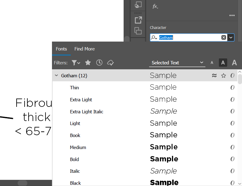
You’ll see the distinction in graphic software like in Illustrator and Photoshop that every other font is listed several times with variations, fonts of the same typeface. However, now since everything is digital and most people do the bold or italic via software, typeface and font are used interchangeably.

Choosing a good typeface is like putting a finely tailored suit to the words you put into your medical illustration or infographic, it’s the detail in the composition that adds interest to the copy. That’s why the choice of font/typeface can really add value to your design.
Someone said that good typeface is like a glass, it should be clear enough that the contents are what you see and not the container itself. I find that to be true when it comes to good typeface/fonts choices.
You can choose a font family and use it consistently throughout a project for uniformity.
Fonts
The font is a complete character set within a typeface of a specific style or size.
Related: How to install fonts on your Windows or Mac OS.
- Numbers are called figures.
- Ligatures are combined words or letters like æ
Text type is for the body of text, must be easy to read under 12pt.
Display type is for headlines, read above 14pt, it should be used sparingly.
- Serifs: good for traditional and prints. Easy to read.
- Sans serif: don’t have the serifs and modern and clean look. Tends to be easier to read on screens.
- Display/Decorative: best for small amounts of text like titles and headers and heavy design.
- Script: they wanna emulate handwrite.
- Monospace: all the characters are the same width.
- Dingbats and specialty: they have symbols instead of letters and numbers. Limited use and specific tasks.
Check out this list of free serif fonts, elegant choices for any medical illustration project.
Font variations
- Small caps are all uppercase but reduce characters that would be lowercase to their lowercase height.
- Narrow/condensed they are variations where all characters are of reduced weight.
- Extended: are the opposite. They fill more space horizontally. Good at drawing attention, but useless for large bodies of text.
Each typeface has several font variations, usually in four major categories
- Regular
- Bold italic
- Bold
- Italic
- Oblique: used interchangeably but means unique character set.
Some fonts have variable weight, which offers sliders to choose the weight (how bold is it)
Italics came to be because Italians wanted a typeface that allowed them to cram more words in the same paper, as it was expensive.
Weight
Is the thickness of the font, it contributes to the color that the overall text will take.
Font Size
Fonts are measured in points “pt”. Based on core size of 1 inch/72 pt, meaning a 72pt font should be 1inch tall. In certain digital environments like web, font size might be determined in other ways
- Px: pixels
- Em: based on percentage based on current font size
- %: based on default font size of 12pt
Pro tip: You can get free fonts at Google Fonts.
Working with numbers
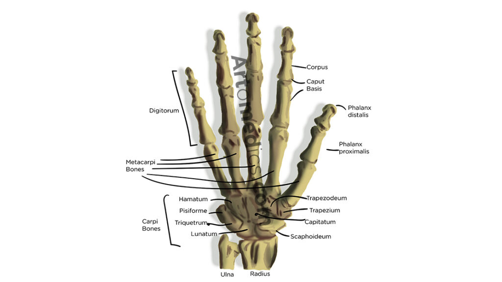
It may not seem like a big deal but as medical illustrators we use numbers to indicate sizes, measurements and quantities in our illustrations, so it’s important to know fonts include different types of numbers for different uses.
- Lining numbers: All the numbers are in the same line. Works great with capital letters. The look uncomfortable within the Text Type. If they don’t you’re using only lining numbers, reduce the size a bit.
- Tabular numbers: Fixed width to ensure columns of data align correctly.
- Old style numbers: different heights and baselines, ascenders and descenders. Intended to be used within text. They blend into the color of the text.
- Properly Weighted fractional : Most fonts have the usual suspects. But some fonts have all the numbers you need to create your own fractional.
Fonts and associations
Just like clothes are associated with certain qualities like professionalism, youth, fun, sporty and casual, fonts have certain associations attached to them like formality and simplicity for example.
Others, however, have a negative past, imprinted in the average reader’s mind.
- Comic sans
- Jokerman
- Curlz
- Brush script
- Kristen
- Papyrus
- Hobo
Also related to typography, check out our article on Text layout and composition for medical illustrators.
If you liked this article, browse other articles about Typography on the site.
What’s your favorite font to use in medical illustration projects? Leave it in the comments section below.

Leave a Reply